Case study
Turning high-volume social data into a clear path from signal to decision

Project overview
Pendulum analyses billions of pieces of social content so teams can spot threats early. But that scale created a triage problem: critical narratives were buried among ordinary posts, giving analysts access to everything and a clear path through almost none of it.
How might we help an analyst move from billions of posts to a defensible decision without losing the evidence along the way?
From audit to strategy
A UX audit revealed three recurring breaks: analysts struggled to prioritise risk, trace insights back to evidence and carry context between investigations.
We reorganised the experience around a simple progression: scan for emerging patterns, investigate the evidence behind them and monitor what matters in reusable dashboards.








At first, the stream feels manageable
At low volume, an analyst can still read individual posts across formats and decide what deserves attention.
Then the volume outruns attention
As the stream grows, potentially important posts repeat across platforms, arrive in every format and look almost exactly like everything else. Reading more is no longer a strategy; the product has to reveal what is related and why it matters.
The feed becomes a set of patterns
The system groups related content across platforms: repeated text reveals coordination, variations trace a narrative, and calls to action stand apart from the surrounding chatter.
Patterns become terrain
Spatial, scannable and legible at a glance.
- Height shows volume: how loud a story is.
- Colour shows severity: how dangerous it is.
- Distance shows how narratives relate.
The loudest peak is rarely the most dangerous one. Now analysts can see that.
A pattern is a lead, not an answer
Analysts still need to know why a signal matters. In the shipped RiskWand landscape, selecting a peak opens the evidence behind it: the posts, accounts and metrics driving the pattern.
From signal to explanation
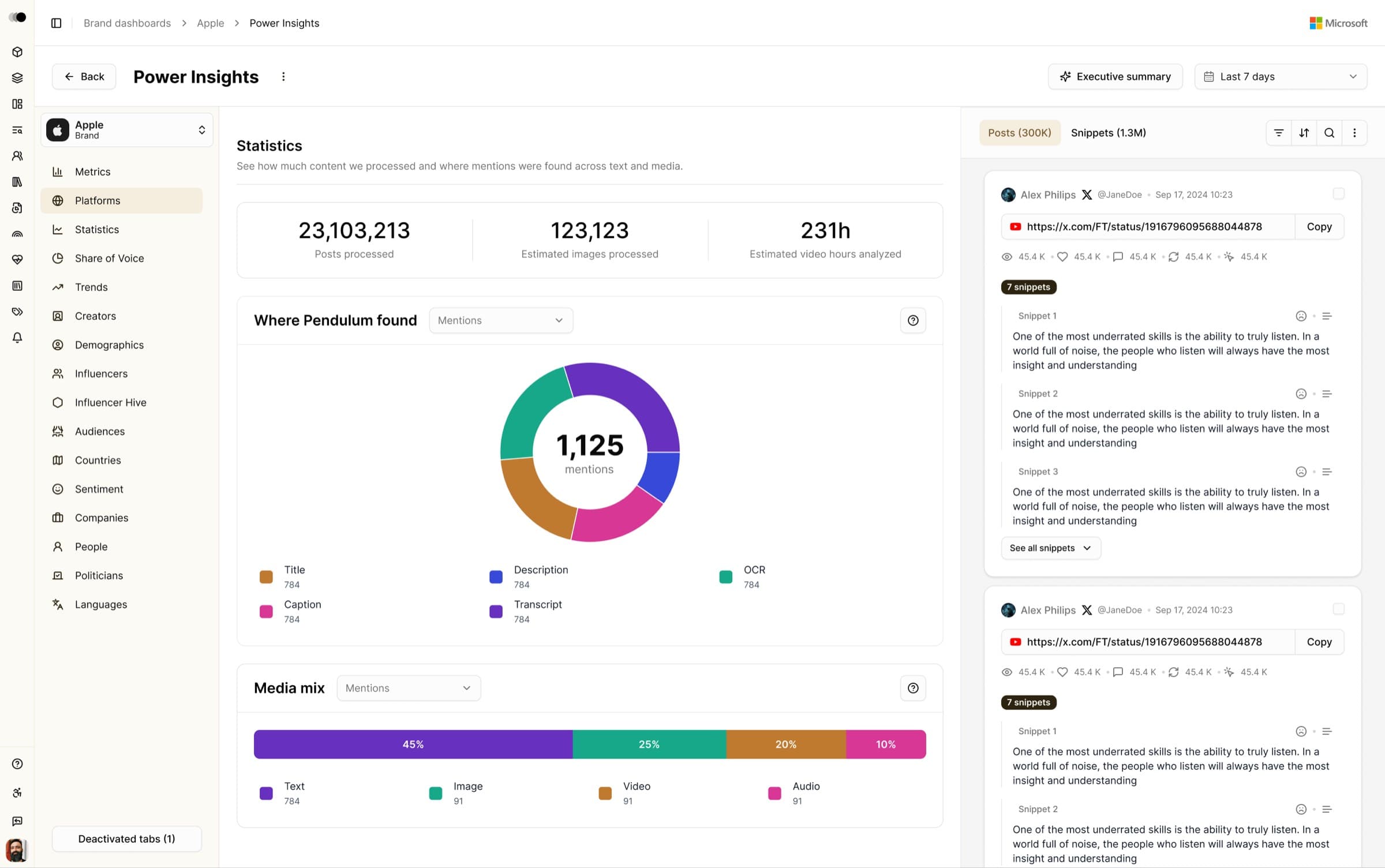
Power Insights keeps analytics and evidence in one workflow. Analysts move from a spike, to the platforms and media carrying it, to the exact conversations driving it, without losing the thread.
From investigation to monitoring
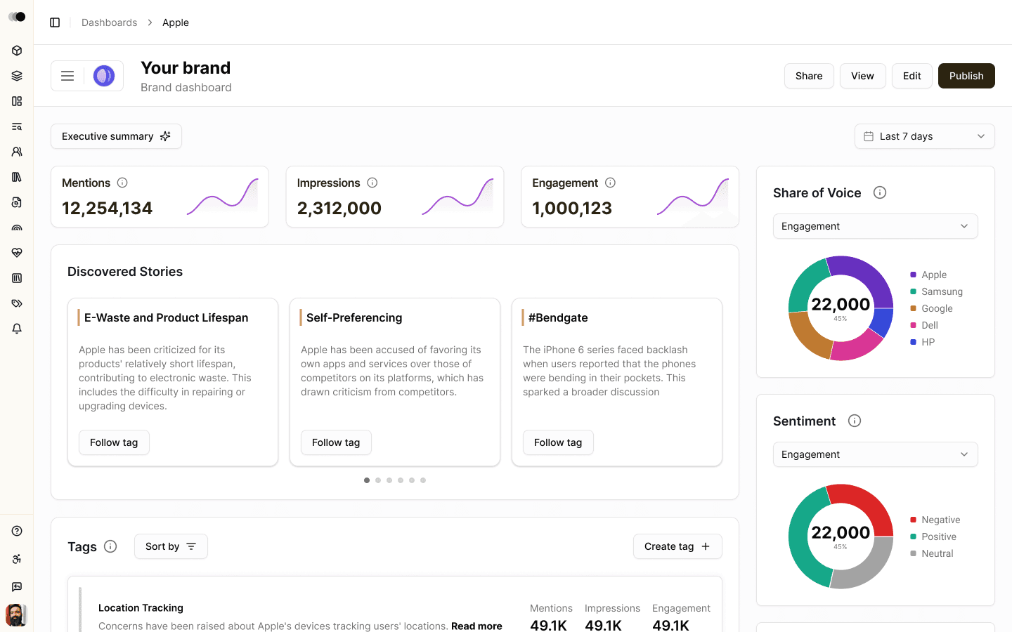
RiskWand surfaces the signal and Power Insights explains it. Configurable dashboards complete the workflow, letting teams save the charts, maps, feeds and risk summaries each investigation requires.
Product impact
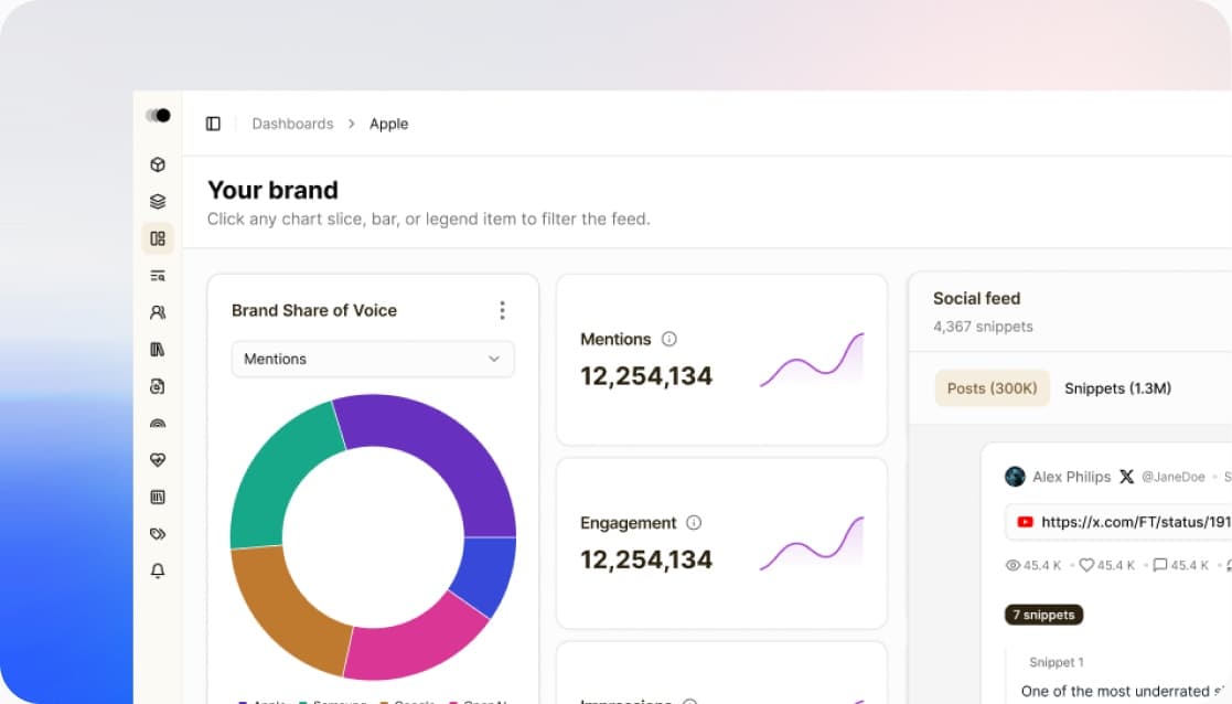
RiskWand, Power Insights and configurable dashboards shipped as one connected experience, with redesigned navigation bringing them into the main workflow. Together, they shifted Pendulum from raw data access towards guided intelligence: from noise, to pattern, to evidence, to decision.
The simpler workflows also made the product relevant beyond specialist risk analysts — to communications professionals and brand teams. Just as importantly, Pendulum's strongest capabilities no longer depended on users already knowing where to find them.
What I learned
Pendulum reinforced an idea that has shaped my work ever since:
When information is overwhelming, the job of design is not to flatten reality into something simple. It is to build interaction models that help people understand complexity and act on it with confidence.
Want to learn more? Contact me here: